
First batch o’ t-shirt designs
In our never-ending quest to move up in the world of servers (You catch that outage last night? Wasn’t that great?), we put out a call a month ago for designs. Here’s the first batch, for your consideration. Please comment if you like ’em, don’t like ’em, and as always, if you want to give this a shot yourself, you know our email address.
Designs below the break, as I didn’t want to try and serve even these modest thumbnails to everyone who visited. I look forward to hearing what everyone thinks — I’d buy some of these now.
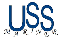
JoelE, who does this for a living (and has a band), submitted three logos, which don’t quite show up well on their own, so they’re also are shown here in pictures he also submitted as shirts, where they really shine:
![]()
Which looks like:
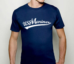
Nice fade.
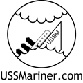
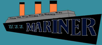
![]()
You can see the ship better here:
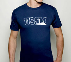
Similarly:
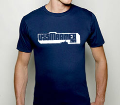
![]()
Soooo he tossed us this mockup of the shirt:
David Arnott has these two designs for hoodies:
and
Mike Lien:
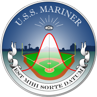
Scott Farley:
I’m not sure if the sinking ship is supposed to mean something, and I’m afraid to ask.
“Ambivalent Maybe” submitted this:
and a set of logos with latin phrases, like

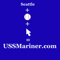
And some time ago, Brett threw this out as a concept he sketched out in MS Paint:
Comments
35 Responses to “First batch o’ t-shirt designs”
Leave a Reply
You must be logged in to post a comment.
That’s a sinking ship?? I thought it was a parking garage.
So far, I like Farley’s sinking ship. When the Mariners hit .500 or thereabouts he could easily redesign it to a floating ship. And in the event of a divisional title, tack some afterburners onto that sucker.
The sinking ship also fits several of our current Mariners. For example, it might serve as WFB’s uniform logo with the slogan “I [frowny face] walks”.
Or for Hargrove: “I [heart] cronies.”
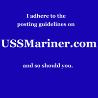
The only one I dislike is the “I adhere to the Posting Guidelines” one. Half the readership can’t honestly buy it.
“ERA is overrated.
USSMariner.com”
AthleticsNation did “In Billy We Trust”.
Shame we can’t say the same.
Wow, I like Joel’s blue and white shirt one a lot better than mine
The Mariners might be sinking, but USSMariner.com is still sailing fine.
“I adhere to posting guidelines” sounds a little more like a bumper sticker, but it’s still funny.
I like the third one down a lot (the last of JoelE’s designs)
I’d buy that one.
I vote for JoelE’s #2. Looks like a college logo, and I like that look. Clean and classic.
The sinking ship is terrifically funny, but temporal. My vote’s for Ambivalent Maybe’s classical design. It’s got it all: The Seattle skyline, the foul poles, the little eye from the one dollar bill (invoking both bill Bavasi and the M’s spending habits), and of course the Latin (“my kind of data” for you Ballard High dropouts). What good’s a tee shirt you can’t wear to a dinner party?
I’d buy #1, #2, and #3, in that order (all are a heck of a lot better than I can come up with, though).
I agree with Thoan. Ambivalent Maybe’s design is something I would buy in a heartbeat, and I’m sure would get everybody I know to ask about it (think of the free publicity USSM crew!). Latin, the Space Needle, and a bell-shaped curve — what else is there in life?
I’m simple,
I like #2 from the top.
more of a logo than a cypher to me.
would you consider backing more than one design?
I like JoelE’s #1 and #2, in that order, and laughed out loud at the “I adhere…” one. I would buy any of those.
But I would not buy a hot dog from the NFC championship game for $7,000 plus. (I saw the article in the San Antonio Express-News sports section on Sunday.)
Aaah, man! I was hoping to see the “I Comment Less than Corco!” version 🙂
I think the “I adhere…” one fits. Go with that one.
FWIW, there will be a couple random “text on T-shirt” ones, probably including a Corco-related one.
I like number 1 best – classic, timeless. The sinking ship makes me think of the Canucks old logo with the skate pointing downhill – they changed it because they felt that was just too bad an omen.
I’m with ChrisB. The first shirt is quite fetching. Also I always pictured the Mariner boat as a benign tug with a pop-gun for a cannon, not a menacing gun-ship (#’s 2 and 3). Just me, perhaps.
That’s fine.
David M.: The U.S.S. Mariner was a tugboat. See the link on the left, second from the bottom. I also like No 1 the best, for the same reasons as you.
For a text shirt, I nominate the old yes/no drop down menu (along the lines of “I am a spammer and/or intend to post a comment out of line with the comment guidelines”)
The skyline one is my favorite too.
I like the text of, “We watch the games so you don’t have to.”
Seeing how the Fanfest got a loud boo every time it was mentioned at the Seahawks rally, it might be quite relevant next year.
#21– Seeing how the Fanfest got a loud boo every time it was mentioned at the Seahawks rally
hmm. surprising to hear that, as a large proportion of Sunday fans at Fanfest were still wearing their Seahawks shirts with their faces still painted… 🙂
I too like No. 1, and agree with the comments about the look of the vessel as even the original was the tug Mariner
dagnabbit. ok, with proper coding, here is the Mariner
22/23: thanks for the tug link. that’s’ what i was looking for. i’ll try to update the design sometime with a proper boat.
top 5 are my top 5
I love JoelE’s second design. I’d happily wear that.
I feel compelled to try and answer Derek’s question of “why is the ship sinking”? The truth is that there is a certain fatalism that comes from knowing to much about your favorite team.
But to add a bit of levity, here is a list of suggested responses to “Why is the ship sinking”?
1). It’s not sinking, it is making a productive out
2). In a park that depress singles and doubles but increases home runs, you need to focus on pitches with a downward motion in the zone.
3). In baseball, only 3 of 10 boats actually float.
4). Do you understand the concept of replacement level talent? Neither did the crew.
5). It may be sinking, but 3rd order wins show buoyancy!
6). Two words, “Bud Selig”
7). It is not sinking, just trying to improve it’s G/F ratio.
8). Never trade your AA hull to Billy Beane for a veteran anchor.
9). Forbes torpedo
10). It’s not sinking, it is just listing. We are hoping to bail it out with our outfield defense.
11). The ship represents how well the PFD is managing your tax-payer dollars.
12). PECOTA says “Collapse”
13). It is not sinking, it is crossing the bar to the World Series!
JoelE’s designs are quite nice, I’d wear any of them.
Perhaps Scott Farley’s list can be incorporated into a “Top Ten” list on the back somehow.
(hee hee. “It’s not Sinking, it’s Snelling!”)
“USSMariner: It’s not the motion in the ocean, it’s the size of the sample”
I wonder how that would sound in latin?
JoelE number 2 is awesome. I’d buy it if it led to proceeds for the site.
I like JoelE’s first one — that’s classic baseball lettering all by itself. His next two, besides having the wrong boat, don’t say baseball to me; I’d want to work that in somehow.
Other than that, I only really like Ambivalent Maybe’s design
JoelE’s designs are wonderful. I plan on buying some shirts to support the cause.
Gotta go with the professional’s designs. FWIW, I love the first two, “worn USS Mariner” and “USSM-ship” logos, more than the blocky third one.
JoelE’s #1, followed by #3 if it included the tug. Definitely willing to support the cause.
Oddly enough, I very rairly actually post a reply. That being said, if my vote still has any weight at all, I’d go for number 1 or Ambivlent Maybe’s. Either way, really. Or neither way. Your call.