
There is science to be done, there is research to be run…
DMZ · October 17, 2007 at 7:27 pm · Filed Under Mariners
… on the people who are still alive*
M’s hitting since moving into Safeco Field, charted against league averages
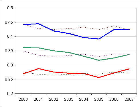
Red is batting average
The other one is OBP
The top one is SLG
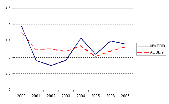
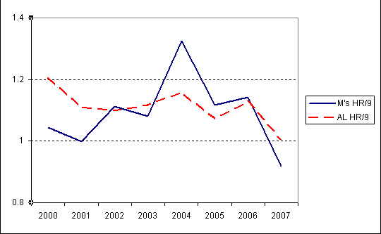
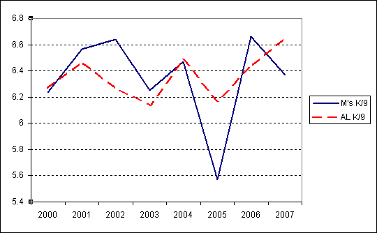
And on the other side, some pitching indicators.
Walk rate per nine innings (lower is better)
HR allowed rate per nine innings (lower is better)
Stirkeout rate per nine innings (higher is better)
* Portalllllllllllllllll!!!!
Comments
34 Responses to “There is science to be done, there is research to be run…”
Leave a Reply
You must be logged in to post a comment.
Where do these variances fall in in terms of our division/league opponents?
All these graphs really make me miss 2001.
Fun!
Edward Tufte — The Visual Display of Quantitative Information — would note that graphs like this that don’t begin at zero exaggerate the effect of the data, the worst offender here being Strikeout Rate, where 2005 is made to appear a much bigger outlier than it is.
I guess. My counter would be that they looked really crappy at 0, and the bounds are set more or less at the outlier points.
my brain is full.
I don’t know what the statistical odds of this were, but Kranitz hired on with the O’s
Edward Tufte — The Visual Display of Quantitative Information — would note that graphs like this that don’t begin at zero exaggerate the effect of the data, the worst offender here being Strikeout Rate, where 2005 is made to appear a much bigger outlier than it is.
I’ve heard this ridiculousness before about graphs in general, and it’s just that–ridiculous. All including the origin does is to waste a bunch of perfectly useful space on the graph. The vertical axis is labelled perfectly well in each graph–there’s nothing disingenuous about the data presentation. If the viewer has a reason to believe that 0.6 K/9 is a large variance, then you would even be doing him a disservice by including the origin and making all of the variations look tiny.
Texas had 6.1 K/9 this year, which was more or less worst in the AL. That was only 0.5 K/9 below league average (according to me eyeballing DMZ’s graph.) I would argue that 0.6 K/9 is in fact a significant variation for a team’s season total. Over 1400 IP, that’s something like 93 strikeouts and is basically the difference between average and the worst.
If you really wanted to properly account for what a “significant” variance from the league average was, you could add some one-sigma error bars around the league average to give the viewer an idea on what the variance is, but artificially including the origin is counterproductive.
Tufte would also dim the background hash marks to a very faint gray.
Took an Information Visualization class, very interesting.
You mean the in each of the past four years, the Mariners have had higher than league average walks?
Oh, that’s the pitchers.
Tweaked it to make that clearer.
7 – I agree completely. 1/2 a strikeout less here, a walk more there and you’ve got the difference between San Diego’s pitching and Tampa Bay’s. Its never very much different. The end result is a few small differences happening over and over during the course of a season adding up to a big difference.
I just took the Tufte one-day seminar on Monday!
All including the origin does is to waste a bunch of perfectly useful space on the graph. The vertical axis is labelled perfectly well in each graph–there’s nothing disingenuous about the data presentation. If the viewer has a reason to believe that 0.6 K/9 is a large variance, then you would even be doing him a disservice by including the origin and making all of the variations look tiny.
His point is that not starting from the orgin distorts the data by making small variances seem enormous. You can manipulate how important a small variance can be by skewing the vertical axis, which would be a dishonest way or presenting the data.
Just to be clear, I don’t think that is what DMZ is doing with these graphs — it’s such a small space to work with that I don’t even know how the graphs will work starting from zero — but Tufte would probably argue that the data should then be presented in tables or as a graph handed out to the audience on bigger paper instead (so DMZ, we’ll all send you our addresses and you can ship them to us).
Tufte used sports data at least twice in his presentation that I can recall. He said a few times that we should look at how information is presented in the Sports or Mutual Funds section rather than how the PowerPoint Templates use tables as a way of effectively displaying data, and he also had a graphic (I think in his new book) showing the baseball standings with varying space between the teams based on games above or below .500, so the AL East of a few years ago looked like this:
New York
Boston
Baltimore
Toronto
Tampa Bay
I don’t know that I agree with him on everything, but it’s an interesting opportunity to think about different ways of presenting data effectively.
Derek, I wish I could appreciate these graphs, but I’m still too distraught over what happened to my Weighted Companion Cube.
His point is that not starting from the orgin distorts the data by making small variances seem enormous.
Except that the axes are labeled, so the variances are exactly the amounts presented. If people look at graphs without looking at the axes to see the magnitude of the changes, they are misleading themselves, not being mislead by the presenter.
but Tufte would probably argue that the data should then be presented in tables or as a graph handed out to the audience on bigger paper instead
Not sure what field Tufte is in but this is totally impractical, at least in my field. Looking through a table takes time and annoys the audience. Handing out paper to the audience? No thanks.
Sure, and I’m a Tufte guy and all, but:
a) a major league average staff will have a K rate of ~6/9 IP, an astoundingly good one will have a K rate of ~7.5 or 8/9 IP, and a truly sucky one might be able to get down to 4.5… but probably not. The actual range of outcomes is 4.5-8, not 0-8. Small variations aren’t exaggerated – they’re large variations.
b) it looked like crap using 0, and the whole thing’s supposed to be about the useful display of information, right?
I’m still too distraught over what happened to my Weighted Companion Cube.
It’s no use trying to pretend “something happened” as if you weren’t responsible. We know what happened. You did it.
I think if Seattle really did replace the Moose with a Weighted Companion Cube, they might be pleasantly surprised at the increase in merchandise sales.
Especially a talking weighted companion cube, that gives you advice, and you can sing songs with it, just like a real weighted companion cube… like the one S-Mac killed.
Off Tufte, back to the team — On the plus side, the offense is trending up despite one of the highest paid bats on the team being one of the worst players, a potential star is ready to come into his own, and there are positive adjustments to be made.
ahem. “Stirkeout rate per nine innings (higher is better)”
aside from that, how about a graph showing LOB … that would be a scary sight over the last few years.
19: Amen. In addition, we’re playing in the pitcher’s park, right? So compared to league averages, we’re doing pretty well, and if Jones starts, maybe we can do even better.
This graphs are not nearly as depressing, at least in regards to 2007, as I expected them to be. Now 2005… that was bad.
Perhaps barely clinging to the topic [nope]
Obviously, “This graphs” should be “These graphs.” Wow, that’s embarrassing. Note to self: re-read before posting.
You can manipulate how important a small variance can be by skewing the vertical axis, which would be a dishonest way or presenting the data.
If the values and units are clearly labelled on the axes, there’s nothing dishonest about it at all. Just because people are bad at interpreting data unless you spell everything out for them doesn’t mean you’re misleading them by not doing it. You’re just letting them make their own mistakes – that’s their fault, not yours.
The biggest advantage of the Weighted Companion Cube over the Moose? It will never stab you.
it doesn’t sound like they’ve offered it to anyone yet; they had an interview, he chose Baltimore (which apparently was not unexpected due to his prior relationships with MacPhail & Trembley)
how about a graph showing LOB … that would be a scary sight over the last few years.
Shouldn’t be too bad. To leave guys on base you have to get them there, first, and we haven’t been very good at that.
Actually, looking at the first graph, the our slugging lagged a lot farther behind league average than our OBP did in 2004, so the LOB would probably be terrible there.
Actually, I’ve seen some dishonest, clearly labelled graphs before. I had a annual stock report in which the y-axis for profits were labelled in the 10 millions, while debt was labelled in the billions. For the casual reader (most stock holders breeze through these things), debt LOOKED really small on its graph, while profits completely consumed its graph. The debts were in fact much larger than the profits.
What makes the graphs presented on this site not dishonest is the fact that they are relative. In this case the origin would be correctly identified as the average of the league averages, not the zero. A graph that included the zero would incorrectly make the data appear to be less varied.
What would these graphs look like with park adjustments?
Derek, I take your point. I think I agree that if your graph is bounded by the actual extremes that ever occur in the data, you’re basically presenting a true graphic picture.
tgf and Evan, I disagree with the general point about labeled axes, particularly arguments like “If people look at graphs without looking at the axes to see the magnitude of the changes, they are misleading themselves” and “Just because people are bad at interpreting data unless you spell everything out for them doesn’t mean you’re misleading them by not doing it”. The whole point of graphic presentation is to simplify and to give a true picture in a glance. If people have to look closely at the labeling and adjust the picture in their minds accordingly, the graph is a distortion; it has created an untrue mind-picture that needs to be fixed with closer inspection. If you’re going to say “well, people shouldn’t be careless”, you might as well just give the raw data. (Again, I’m not arguing with Derek’s presentation here.)
[ot]
28 makes the same point in fewer words.
So the pitchers aren’t giving up homeruns, but other than that they are doing every thing else to prevent outs and increase opponent runs – aided and abetted mightily by our old nemesis, the glove.
The mariners had 9 more wins than their pythagorean w/l.
Last year’s success is not sustainable – it is a clear fluke.
The whole point of graphic presentation is to simplify and to give a true picture in a glance.
This is the point which should be emphasized then, not silly rules like “zero must be included.” Concentrating on providing a true picture can lead to better graphical presentation of data, but concentrating on rules of thumb is a poor substitute for actively thinking about how the data ought to be presented, and can be counterproductive in many cases.